Paper Prototype Testing: Free Template, Script and 5-User Plan
You need no designer and no code to find out your flow is confusing. You need paper, a pen, five people and the discipline to stay quiet.
Share
Paper prototype testing means sketching the key screens of a product on paper, then asking a real user to finish one task while a teammate "plays computer" and swaps the sheets each time they tap. It finds confusing steps and unclear labels before anyone designs or codes, usually within two days and for the price of paper. Below is a free template, a facilitator script and a pass signal.
Key takeaways
Test five people from one segment per round. Jakob Nielsen's model found five users uncover about 85% of usability problems, and he advises three rounds of five over one round of 15 (Nielsen Norman Group, 2000).
Paper finds most of what a polished prototype finds. In one CHI 1996 study, paper found 32 of 38 problems and a high-fidelity version 34 (Virzi, Sokolov and Karis).
Changes are cheapest now. Nielsen cites the common estimate that a change before code costs about 100 times less than one after implementation (Nielsen Norman Group, 2003).
It tells you whether a flow makes sense, not whether anyone wants it.
Set the pass signal before the first session: at least 4 of 5 people finish without help.
What is paper prototype testing?
A paper prototype is a hand-drawn version of the screens one job needs, with real words on every button. In the test, three roles keep the session honest:
Facilitator. Reads the task aloud, asks the person to think aloud, and stays neutral. No explaining, no agreeing.
Computer. Swaps sheets and sticky notes as the person taps, and never explains what a screen is for. Carolyn Snyder's Paper Prototyping (Morgan Kaufmann, 2003), the standard book on the method, is built around this role (UXmatters review, 2006).
Note-taker. Writes down every pause, wrong tap and guess, in the person's words.
The think-aloud part does the heavy lifting. Nielsen describes the recipe as representative users, representative tasks, and then you shut up, and notes that it works on everything from paper prototypes to finished systems (Nielsen Norman Group, 2012).
In David J. Bland and Alex Osterwalder's Testing Business Ideas, the paper prototype sits in the discovery library as a "discussion prototype", next to the storyboard test and the 3D print.
What goes in a paper prototype kit?
One sheet or index card per screen, drawn in pen, not pencil
Sticky notes for menus, pop-ups, confirmations and error messages
A clear plastic sleeve over any form, so people can "type" with a dry-wipe marker
A card that says "Loading…", for steps the real system would take time on
Blank cards, so the computer can sketch a screen you forgot, mid-session
When should you use a paper prototype test, and when not?
Use it at the very start of a design, when changing your mind costs a pencil stroke. It works well for checking the order of steps and the words on buttons. People also feel free to criticise a sketch, because it obviously is not finished.
Do not use it to test visual design, animation, or how something feels at speed. Do not use it on a flow that relies on real data, such as search results. If you have already passed this stage, a clickable prototype is the next step. If your doubt is only about how to name or group things, a card sort is quicker. And it says little about whether anyone wants the product. Someone can complete a sketch of a task they do not care about.
Which risk does it test, and how strong is the evidence?
This tests desirability in the sense of "can they get the job done this way?" The evidence is behaviour, because you are watching what people do. It is small and artificial, though, so a good result only tells you the flow makes sense.
Strategyzer's experiment library for Testing Business Ideas rates the paper prototype 1 out of 5 for cost and 1 out of 5 for evidence strength (Strategyzer poster). It is the cheapest rung on the ladder and the weakest evidence. Our guide to choosing a product experiment has the bigger picture.
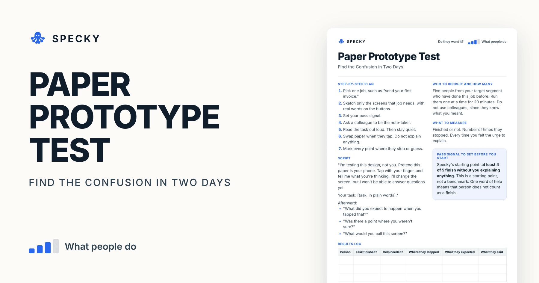
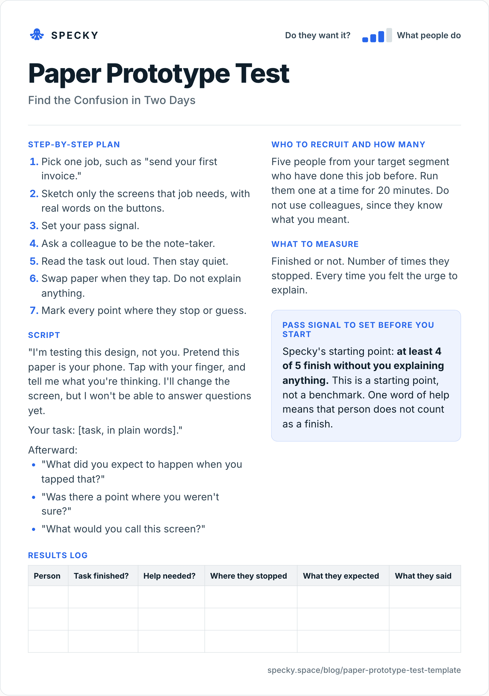
Paper prototype test template (copy and use)
Open the image at full size, or copy the text version below.
Who to recruit and how many
Five people from your target segment who have done this job before. Run them one at a time for 20 minutes. Do not use colleagues, since they know what you meant.
Step-by-step plan
Pick one job, such as "send your first invoice."
Sketch only the screens that job needs, with real words on the buttons.
Set your pass signal.
Ask a colleague to be the note-taker.
Read the task out loud. Then stay quiet.
Swap paper when they tap. Do not explain anything.
Mark every point where they stop or guess.
Script
"I'm testing this design, not you. Pretend this paper is your phone. Tap with your finger, and tell me what you're thinking. I'll change the screen, but I won't be able to answer questions yet.
Your task: [task, in plain words]."
Afterward:
"What did you expect to happen when you tapped that?"
"Was there a point where you weren't sure?"
"What would you call this screen?"
What to measure
Finished or not. Number of times they stopped. Every time you felt the urge to explain.
Pass signal to set before you start
Specky's starting point: at least 4 of 5 finish without you explaining anything. This is a starting point, not a benchmark. One word of help means that person does not count as a finish.
Results log
Person
Task finished?
Help needed?
Where they stopped
What they expected
What they said
How do you run the session without giving the answer away?
The template's seven steps cover the plan. These rules cover the 20 minutes in the room:
Book 30-minute slots. Twenty minutes with the person, ten to reset the paper and write notes while they are fresh.
Rehearse once with a colleague. You will find the missing screen before a real user does.
When someone taps something you did not draw, show nothing. Say "That would do nothing yet. What would you try next?" and log what they expected.
Let silence run. If they stop talking, ask "What are you looking for?" Never "Did you see the button at the top?"
Debrief straight after. Facilitator, computer and note-taker agree on the top three stumbles before the next person arrives.
Fix between sessions when the fix is obvious. Snyder's advice is to leave time between tests to review and change the prototype. Redrawing a card takes a minute. Mark which version each person saw.
Nielsen's warning applies here: a facilitator who prompts carelessly changes what people do and makes the results unrepresentative (Nielsen Norman Group, 2012). If you catch yourself pointing, log it as a finding.
How many users do you need for a paper prototype test?
Five per round, of one type of user. Nielsen's model says the share of problems found with n users is 1 − (1 − L)ⁿ, where L, the share one user finds, averaged 31% across the projects he studied (Nielsen Norman Group, 2000). Plugging in the numbers:
Users in the round
Share of problems found (L = 31%)
1
31%
3
67%
5
84%
10
98%
15
99.6%
Users six to 15 add little. That is why Nielsen recommends spending a 15-person budget on three studies of five, fixing the design between each.
Three caveats:
Different user types need their own rounds. For two groups, Nielsen suggests three to four users each. For three or more groups, three each.
Snyder lands in the same place. Five to eight users of the same profile show the main patterns, according to the UXmatters review of her book.
Design sprints use five too. In the GV design sprint, the team builds a prototype on Thursday and brings in five customers, one at a time, on Friday (Jake Knapp, Knowledge at Wharton, 2016).
The 31% is an average across projects. A problem that trips only one person in ten can slip past five users, which is one more reason to test again after each fix.
Does a paper prototype find the same problems as a clickable one?
Mostly, yes. Virzi, Sokolov and Karis ran two experiments with 10 users per condition, one on a CD-ROM encyclopedia and one on a phone menu system (CHI 1996):
Encyclopedia: 38 problems in total. The high-fidelity version found 34 and paper found 32.
Phone menu: 21 problems in total. The high-fidelity version found 19 and paper found 20.
They concluded that low-fidelity prototypes "can be effective throughout the product development cycle", not just at the start.
Jeff Sauro's review of eight fidelity studies at MeasuringU found the same pattern: most showed no difference in the number of problems (MeasuringU, 2017). Two details matter for planning. In one 1998 study, paper sessions took about 30% longer. In a 2002 study by Walker, Takayama and Landay, the count was similar but the kinds of problems differed by fidelity.
What paper misses is anything about interaction at speed: scrolling, long lists, the size of controls, keyboard against mouse, and response times. Snyder's book flags exactly these, according to the UXmatters review.
Paper prototype vs clickable prototype: which should you use?
Order of steps, labels, what belongs on each screen
Whether the flow holds up close to the real thing, and early signs of desire
Misses
Scrolling, speed, visual design, real data
Real data and real speed, which a mockup still fakes
People's honesty
High: a sketch invites criticism
Lower: polish invites politeness
Move on when
4 of 5 finish without help
4 of 5 finish and 3 ask when they can have it
Use paper while the steps are still moving. Move to a clickable flow once the order is settled and you want to see whether it holds up, and whether anyone asks for it.
What does a paper prototype test look like in practice?
This example is made up to show the method. A team designing a parent-teacher messaging app sketches a flow for sending a message about a sick child. They believe parents will start from the class list.
Five parents try it. Three pause at the first screen and tap the child's name, which does nothing in the sketch. Two ask out loud where the sick-day button is. Only two complete the task without help.
The signal fails. The team sketches a new first screen starting from the child, and runs it again the following day with three more parents. Total cost: some paper and an afternoon.
Here is how the second round could read. All three parents start from the child and finish without help, but two hesitate at a field labelled "Absence type". The team renames it "Why is your child off today?" and moves to a clickable version. That is 2 of 5 in round one and 3 of 3 in round two, five sessions of 20 minutes each, and no code.
What are the most common paper prototyping mistakes?
Sketches that look too finished. People critique the polish, not the flow.
Explaining. Every time you do, you have hidden a finding.
Testing the whole product. One job is plenty.
Using lorem ipsum. People need real words to make decisions.
Testing colleagues. They already know your intent.
A narrating computer. "Now the menu opens" teaches the flow. Swap the sheet in silence.
Changing nothing between rounds. Three rounds of five only beat one round of 15 if you fix things in between.
When it doesn't work: for anything that depends on speed, motion, real data or how it looks, and for any question about demand or price.
Is it fair to test with a sketch?
Yes, as long as nobody is misled. Paper is the most honest prototype there is: nobody mistakes it for a live product. Two habits keep it clean. Ask before you photograph hands or record voices, and say what you will keep and for how long. And do not tell people "it's coming next month" to see their reaction; you are testing a flow, not making a promise.
How to run it in Specky
On the Assumptions page, click the note and choose Pick a test, then Paper prototype. Specky fills in the steps, the pass signal, and a two-day timeline.
You run this one. Specky keeps the plan and the result. Draw the screens, and sit with the participants.
Click Start running. Paste in where each person got stuck.
Record the result.
A pass shows on the board as Supported, because watching someone finish a task is behavior. Keep it in context: what is supported is that this flow makes sense, not that people want it.
What should you do with each outcome?
Supported: Turn it into a clickable prototype, and test whether people ask when they can have it.
Unclear: Some finished, but they hesitated. Change the screens where people paused, and test with three more people.
Contradicted: Most people could not finish. Redo the flow, which costs next to nothing right now. Any bet resting on this note now shows as Contradicted.
A paper prototype is a hand-drawn version of a product's screens that a person can "tap" while someone else swaps the pages. It lets you test a flow before any design or code exists. Most are drawn on paper or index cards, with sticky notes standing in for menus, pop-ups and error messages.
How many users do you need for a paper prototype test?
Five people of one type is the practical start. Nielsen's model estimates five users find about 85% of usability problems. Run them one at a time, fix what you learn, and test again with a few more instead of running many in one round. If you have two distinct user types, test three or four of each.
When should you use a paper prototype instead of a digital one?
Use paper at the very start, when you are still working out the steps and the words. Move to a clickable prototype once the flow makes sense and you need to test something closer to the real thing, such as scrolling, speed or how people react to a realistic screen.
How long does a paper prototype test take?
About two days from start to finish. Sketching the screens for one job takes an afternoon. Each session runs about 20 minutes plus 10 minutes to reset, so five people fit into one morning. Allow a few hours afterwards to compare notes, decide on fixes and redraw the screens for the next round.
Are paper prototypes as good as high-fidelity prototypes for finding problems?
For most usability problems, yes. In Virzi, Sokolov and Karis's 1996 study, paper found 32 of 38 problems against 34 for a high-fidelity version. Paper misses issues that depend on interaction, such as scrolling, control size and response time, so test those once you have a clickable or working version.