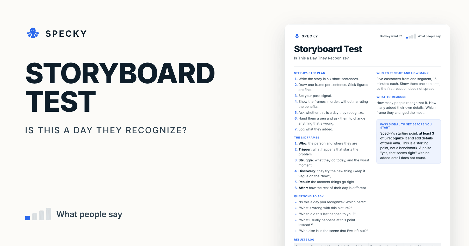
Storyboard Test: Is This a Day Your Customers Recognise?
Draw six stick-figure frames and ask whether this is a day people recognise. The details they add are the point.
Share
A storyboard test shows customers the before and after of a job in four to six rough frames, one person at a time, and asks whether that is a day they recognise. It checks whether the situation you imagined exists before you design a solution, and it takes about two days. The signal is not agreement but the details people correct and add. Below are a free template, frame prompts and a pass signal.
Key takeaways
Use four to six frames. Truong, Hayes and Abowd's 2006 study of storyboards found four to six frames per scenario ideal for end users, according to University of Washington course notes (UW CSE 440, 2021).
Draw badly. Nielsen Norman Group says illustration skills are not a prerequisite and stick figures work (NN/g, 2018).
It is fast and cheap. Strategyzer's experiment library rates the storyboard 2 out of 5 for cost and 1 out of 5 for run time, the quickest rating on the scale.
The evidence is opinion, rated 2 out of 5. Count added details, not nods.
Set the pass signal first: at least 3 of 5 recognise it and add details of their own.
What is a storyboard test?
A storyboard is a short comic strip of a customer's situation. Rachel Krause of Nielsen Norman Group describes a UX storyboard as a sequence of panels that maps a story's main events in order, built from three elements: a scenario, visuals and captions (NN/g, 2018). Captions rarely need more than two short lines.
A storyboard test turns that artefact into an experiment. You show the strip to five customers, one at a time, without explaining it, and ask whether it matches their life. Then you hand them a pen.
In David J. Bland and Alex Osterwalder's Testing Business Ideas, the storyboard is one of the discovery-stage discussion prototypes, next to the paper prototype and the 3D print. Strategyzer's poster rates it 2/5 for cost, 2/5 for setup time, 1/5 for run time and 2/5 for evidence strength, and tags it to desirability and viability (Strategyzer poster).
Is a storyboard test the same as a design sprint storyboard?
No. In the GV design sprint, the team draws a storyboard on Wednesday on a grid of about fifteen squares, five to fifteen steps long, to plan the prototype it will build on Thursday (design sprint guide). That storyboard is an internal planning tool. A storyboard test is shorter, rougher, and shown to customers to check that the situation is real.
When should you use a storyboard test, and when not?
Use it for a new concept that is hard to explain with words, especially one where the benefit happens over time or across several people. A comic strip gets everyone looking at the same story, and it lets people correct it. It takes a couple of days, and needs no artistic talent. The UXPA's Usability Body of Knowledge puts a simple storyboard at a matter of hours to make, and testing and revising it with end users at two to four days (UXPA).
Do not use it to test screens or usability, which belong to a paper prototype. The same UXPA entry notes storyboards are not practical for detailed design. Do not use it as evidence of demand. People will nod along to a nice story, so what you are listening for is the details they add.
Which risk does it test, and how strong is the evidence?
This tests desirability: does the situation you have imagined exist in real life? The evidence is opinion. Recognition is a reaction, not an action. The useful signal is whether people correct the story and add their own details.
That matches the wider research on evidence. Alex Osterwalder notes that what people say and do are different things, and evidence gets stronger the closer it gets to a real purchase (Strategyzer, 2017). Rob Fitzpatrick's The Mom Test makes the same point for conversations: most opinions are worthless, and the way out is to ask about specifics from the past (Unusual Ventures, 2024). That is why the template asks "When did this last happen to you?"
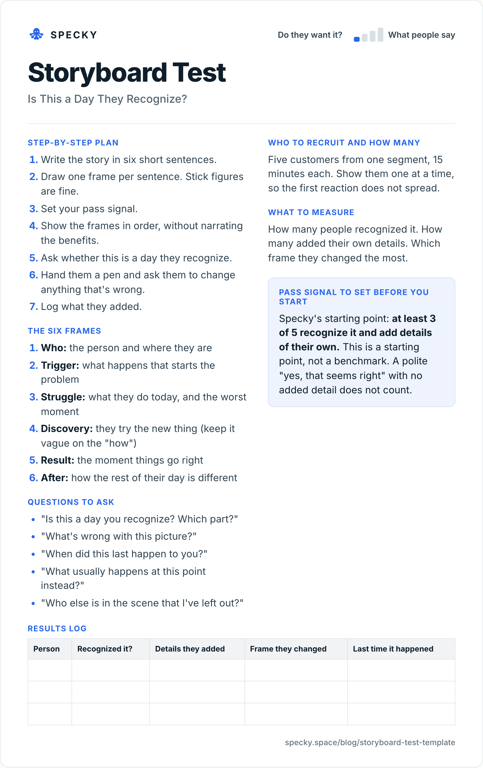
Open the image at full size, or copy the text version below.
Who to recruit and how many
Five customers from one segment, 15 minutes each. Show them one at a time, so the first reaction does not spread.
Step-by-step plan
Write the story in six short sentences.
Draw one frame per sentence. Stick figures are fine.
Set your pass signal.
Show the frames in order, without narrating the benefits.
Ask whether this is a day they recognise.
Hand them a pen and ask them to change anything that's wrong.
Log what they added.
The six frames
Who: the person and where they are
Trigger: what happens that starts the problem
Struggle: what they do today, and the worst moment
Discovery: they try the new thing (keep it vague on the "how")
Result: the moment things go right
After: how the rest of their day is different
Questions to ask
"Is this a day you recognize? Which part?"
"What's wrong with this picture?"
"When did this last happen to you?"
"What usually happens at this point instead?"
"Who else is in the scene that I've left out?"
What to measure
How many people recognised it. How many added their own details. Which frame they changed the most.
Pass signal to set before you start
Specky's starting point: at least 3 of 5 recognise it and add details of their own. This is a starting point, not a benchmark. A polite "yes, that seems right" with no added detail does not count.
Results log
Person
Recognized it?
Details they added
Frame they changed
Last time it happened
How many frames should a storyboard have?
Four to six for a storyboard shown to customers. Truong, Hayes and Abowd's 2006 study at the ACM Designing Interactive Systems conference looked at five choices in a storyboard: level of detail, text, people and emotions, number of frames, and how time is shown. As summarised in University of Washington HCI course notes, their guidelines are (UW CSE 440, 2021):
Choice
Guideline
What it means for your test
Number of frames
4-6 per scenario is ideal for end users; remove unnecessary frames
Specky's six frames sit at the top of the range. Cut one if a frame adds nothing
Level of detail
Too much detail loses universality
Rough frames let more people see themselves in them
Text
Often necessary, but keep it short
One short caption per frame
People and emotions
Show people experiencing the design and their reactions
Draw a face in the Struggle and Result frames
Time
No explicit markers unless the amount of time matters
Add "Sunday, 9pm" only if timing is part of the problem
The UXPA's Usability Body of Knowledge suggests three to five frames as optimal in most cases. Both sources agree on the direction: fewer frames keep attention on the story.
How do you run a storyboard test step by step?
The template has the plan. These rules keep the session honest:
Write the story from research, not hope. Base frames 1 to 3 on what customers have told you. NN/g's process starts by gathering data from interviews or tests.
Show it cold. Lay the frames out in order and say only "Take a look at this." Do not read the captions aloud.
Ask about recognition before value. "Is this a day you recognise?" comes before anything about the new thing in frame 4.
Pull every answer back to a real event. If someone says "I'd always do that," ask them to talk you through the last time it happened.
Hand over the pen early. People correct drawings more readily than they correct you.
Write down added details word for word. Names of people, tools, times of day and workarounds are the data.
Photograph the marked-up strip. The crossed-out frame is the finding.
What should you measure in a storyboard test?
Measure
How to record it
Why it matters
Recognised it
Yes, partly or no, and which frames
The first half of the pass signal
Details added
Count them, and copy them verbatim
The second half, and the real evidence
Frame changed most
Frame number and what they drew
Shows where your story is wrong
Last time it happened
A date or "never"
Separates lived experience from agreement
Missing people
Anyone they added to the scene
Reveals buyers, blockers and helpers
How many people do you need?
Five customers from one segment. That is enough for patterns to show and quick enough to run in a day of 15-minute sessions. Jakob Nielsen's research on usability testing found five users uncover about 85% of problems (NN/g, 2000); a storyboard test is not a usability test, but the logic of small, repeated rounds holds.
If your story involves different roles, such as an owner and a supplier, test them separately; Nielsen suggests three people per group when you have three or more groups. Never show the storyboard to a group. The first person to speak sets the story for everyone else.
Storyboard test vs explainer video vs paper prototype: which should you use?
The usual order is storyboard, then explainer video or landing page, then paper prototype: first the situation, then the desire, then the flow.
What does a storyboard test look like in practice?
This example is made up to show the method. A team imagines a tool for restaurant owners to reorder stock by photographing empty shelves. They draw a six-frame story: Sunday night, an empty shelf, a phone photo, a delivery on Monday.
Five owners look at it. All five say they recognise the empty shelf. But four cross out the frame with the photo, and draw a supplier's rep calling them instead. Two say they would never order on a Sunday, since the suppliers are closed.
Three people recognised it and added details, so the signal passes. But the details change the story. The team's next assumption becomes "owners want to skip the supplier call," rather than "owners want to photograph shelves."
A second round could look like this, also illustrative. The team redraws frames 3 and 4 around the supplier call, set on a Thursday afternoon, and shows five new owners. Four recognise it; three add details, such as the rep calling during the lunch rush and orders written on the back of a delivery note. The redrawn story passes at 3 of 5, and it now describes a problem worth testing with an explainer video.
What are the most common storyboard test mistakes?
Narrating the benefits. If you explain why it is great, they will agree that it is great.
Drawing too well. Rough frames invite correction.
Showing the solution in detail. This test is about the situation.
Counting nods. Details are the signal.
Showing a group. The first person sets the story for the rest.
Too many frames. A 12-frame strip loses people by frame 7. Cut to six.
When it doesn't work: for screens and flows, for questions about price or demand, and for situations people find hard to admit to. If customers can't tell you about a day accurately, watch it with a day in the life study.
Is it fair to show customers a story about their day?
Yes, if you treat it as their story, not yours. Say at the start that it is a rough sketch and you want to know what's wrong with it. Do not imply the product in frame 4 exists, and do not take orders on it. If people share details about colleagues, suppliers or customers, leave names out of your notes, and ask before photographing anything they drew.
How to run it in Specky
On the Assumptions page, click the note and choose Pick a test, then Storyboard. Specky fills in the steps, the pass signal, and a two-day timeline.
You run this one. Specky keeps the plan and the result. Draw it, show it, and listen.
Click Start running. Paste what people added and changed onto the test.
Record the result.
A pass shows on the board as Early signal, not Supported, because recognizing a drawing is opinion.
What should you do with each outcome?
Supported (shows as Early signal): Your scenario is real. Test whether people would act on it with an explainer video or a landing page.
Unclear: They recognised some of it. Redraw the frame people changed the most, and test it again.
Contradicted: People do not recognise it. Your picture of their day is wrong, and it is good to know now. Do a day in the life study. Any bet resting on this note now shows as Contradicted.
Frequently asked questions
What is a storyboard in product testing?
A storyboard is a short comic strip showing a customer's situation before and after using a product. You show it to customers, one at a time, to find out whether the situation is real. The signal is what people correct and add, such as who else is involved or what usually happens at that point.
Do you need to be able to draw for a storyboard test?
No. Stick figures work well, and rough drawings are actually better, because people feel free to correct them. Nielsen Norman Group says advanced illustration skills are not a prerequisite for effective storyboards. A simple strip takes hours, not days, to make.
What should you listen for in a storyboard test?
Listen for details people add on their own, such as who else is involved, what time of day it happens or what usually happens at that point. A polite agreement with no details is weak evidence. Ask when it last happened; a specific date is stronger than "that sounds right."
How many frames should a storyboard have?
Four to six for customers. Truong, Hayes and Abowd's 2006 study found four to six frames per scenario ideal for end users, and the UXPA suggests three to five. Specky's template uses six: who, trigger, struggle, discovery, result and after. Remove any frame that adds nothing to the story.
How long does a storyboard test take?
About two days. Drawing six rough frames takes an hour or two. Five 15-minute sessions fit into one morning or afternoon, and you need a few hours afterwards to compare the marked-up strips and redraw the frame people changed most. The UXPA puts testing and revising with end users at two to four days.