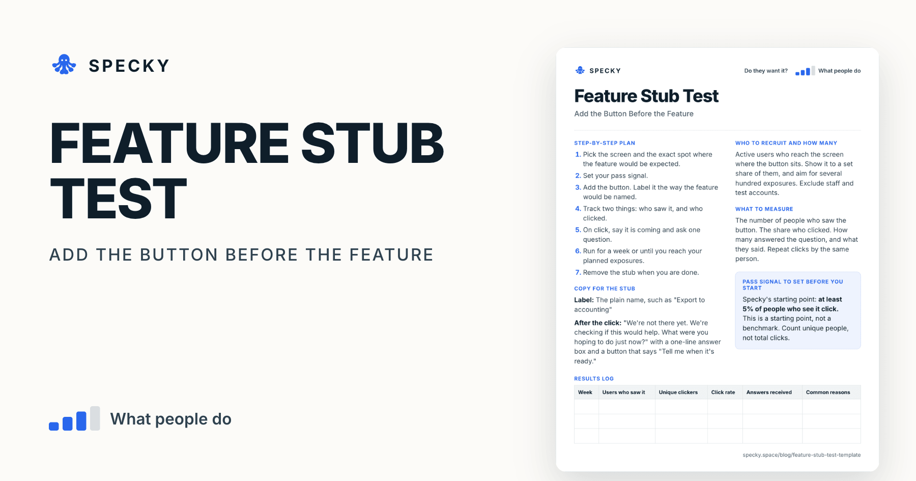
Feature Stub Test Template: Add the Button Before the Feature
The best moment to learn if users want a feature is the moment they reach for it. Add the button first, and count who presses it.
Share
A feature stub test places a real button or menu item for a feature that does not exist yet inside your existing product, exactly where the feature would live. When someone presses it, they learn the feature is coming and get one short question. You learn how many current users reach for it in the middle of real work, before anyone writes the feature.
Key takeaways
The feature stub is one of the "interest discovery" experiments in David J. Bland and Alex Osterwalder's Testing Business Ideas. Strategyzer's library rates it 1 out of 5 for cost, 2 for setup and run time, and 3 to 4 for evidence strength (Strategyzer).
It is the in-product version of the painted door or fake door test (Optimizely).
Most features go unused, which is why the test pays. Across 6,800 Pendo customers, 6.4 of every 100 features drive 80% of click volume (Pendo, 2024).
Run it for about a week and watch whether clicks hold up after the first 48 hours, so novelty does not pass for demand (The Real Startup Book).
This template's starting pass signal: at least 5% of the people who see the button press it, counted as unique people.
What is a feature stub test?
A feature stub is a small, honest placeholder: the entry point to a feature, with nothing behind it yet but a message. A university course built on Testing Business Ideas describes it as a small test of an upcoming function that lets you test demand without building it (UPV course slides).
It answers something a landing page cannot: does this feature occur to people at the moment it would matter? A user who presses "Export to accounting" while closing their month has told you more than a stranger who ticked "yes" on a survey.
Product leader Deb Liu describes the idea as showing customers an option that does not exist yet. In one of her examples, a team added a payment option it had not built in a market where it had little data; clicking it showed a "coming soon" message. Enough users chose it that the team built it ().
Which risk does it test, and how strong is the evidence?
This tests desirability among people who already use your product. The evidence is behaviour: a real person, doing real work, pressed the button. Strategyzer treats behaviour as stronger evidence than stated intentions or opinions (Strategyzer). Still, a click costs almost nothing and only shows interest in the idea. Our guide to choosing a product experiment shows how it compares.
When should you use a feature stub, and when not?
Use it when you have an active product and want to know if current users would reach for a feature during real work. It is the right test when the question is "would they use it here?" rather than "would anyone want it at all?"
Do not use it when:
Too few active users reach that screen. At 30 views a day, a week gives you about 200 exposures, and the numbers will be too small to read.
The screen is a core flow. A dead end in the middle of paying, publishing or sending hurts someone at work. The Real Startup Book also warns against doors on essential flows.
You want to test a new offer with people who are not users yet. Use a fake door.
You only need a first read on curiosity. A 404 test on a busy page is cheaper.
You already have a stub live elsewhere. Several dead ends at once teach users your product is unfinished.
Copy-and-use feature stub test template
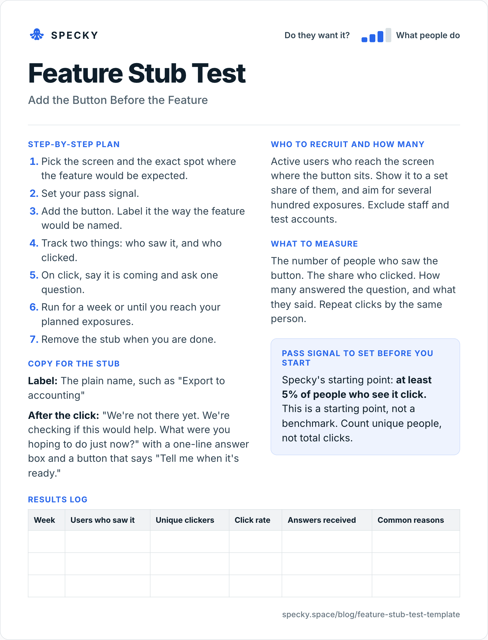
Open the image at full size, or copy the text version below.
Who to recruit and how many
Active users who reach the screen where the button sits. Show it to a set share of them, and aim for several hundred exposures. Exclude staff and test accounts.
Showing it to a set share, such as half, gives you a comparison group. If the half without the button finishes its main task on that screen at the same rate as the half with it, the stub did no harm.
How do you run a feature stub test step by step?
Pick the screen and the exact spot where the feature would be expected.
Set your pass signal.
Add the button. Label it the way the feature would be named.
Track two things: who saw it, and who clicked.
On click, say it is coming and ask one question.
Run for a week or until you reach your planned exposures.
Remove the stub when you are done.
Copy for the stub
Label: The plain name, such as "Export to accounting"
After the click: "We're not there yet. We're checking if this would help. What were you hoping to do just now?" with a one-line answer box and a button that says "Tell me when it's ready."
What should you measure?
The number of people who saw the button. The share who clicked. How many answered the question, and what they said. Repeat clicks by the same person.
Add two checks:
Clicks after day two. The Real Startup Book suggests watching the rate after the first 48 hours, to separate novelty from demand.
The screen's main task. Completion should not drop in the group that sees the stub.
Pass signal to set before you start
Specky's starting point: at least 5% of people who see it click. This is a starting point, not a benchmark. Count unique people, not total clicks.
Results log
Week
Users who saw it
Unique clickers
Click rate
Answers received
Common reasons
How many users need to see a feature stub?
A few hundred unique people, at minimum; The Real Startup Book puts the floor for a directional signal at 200 views. Fewer than that and one or two clicks swing the rate. Here is the 95% range (a Wilson score interval, which we calculated) around a measured 5%:
Users who saw it
Unique clickers at 5%
Plausible true rate (95%)
200
10
2.7% to 9.0%
500
25
3.4% to 7.3%
1,000
50
3.8% to 6.5%
If your measured rate lands right on 5% with 200 exposures, you have not learned whether it passes. Either plan for more exposures or set the bar knowing the range is wide. Decide the end point before you start: in Evan Miller's example, stopping at the first "significant" result raised the false positive rate from 5% to about 26.1% (Evan Miller, 2010).
Worked example (hypothetical)
This example is made up to show the method. A team running a project-tracking tool for small agencies thinks clients would like a shared view of progress. They add a "Share with client" button on the project page, and show it to all active users for a week.
Of 640 users who saw the button, 58 clicked, or 9%. In the short answers, most say they wanted to send a weekly update and not grant access. Several wrote that they would never let a client log in.
The pass signal is met, but the reason is different from what the team planned. They write a new assumption, about a client-ready weekly update, and test that instead of a client portal.
The detail behind it. The 95% range for 58 of 640 is about 7.1% to 11.5%, so the pass is firm. Thirty-one people clicked in the first two days and 27 in the last five, so interest did not fade with novelty. Of the 58, 37 answered the question: 24 mentioned a weekly update and 5 said they would never give a client a login. The click rate tested the button. The answers changed the feature. A stub without the question would have sent the team off to build a portal most clickers did not want.
Feature stub vs fake door test vs single-feature MVP
Ratings from Strategyzer's experiment library poster. Pick the stub when you have users and the doubt is timing and placement; pick the fake door when you are testing an offer on people who do not use your product yet.
Is a feature stub the same as an A/B test?
No. An A/B test compares two working versions on an outcome you already measure. A stub measures interest in something that does not work yet. You can borrow the A/B set-up, showing the stub to half your users, to check that the button does no harm.
Is it fair to show users a button that doesn't work?
It is, if the moment after the click is honest and short. Optimizely's guidance on painted doors is to make sure the element does not mislead users into thinking it is fully functional (Optimizely). Liu adds two rules: do not leave people at a dead end, and close the loop by thanking them and saying what you learned (Deb Liu, 2022).
In practice:
Say "not yet" in the first sentence after the click, then return the person to where they were.
Ask one question, never a form. They were in the middle of work.
Offer something back, such as early access when it ships.
Tell the people who answered what you decided, including "not now".
Common mistakes
Putting it where nobody looks. A low click rate on a hidden button says nothing about demand.
Leaving it up for months. A dead button slowly teaches people your product is broken.
Skipping the question. You learn the click rate, and miss the reason.
Counting clicks instead of people. Three clicks from one frustrated person is not three customers.
Labelling it cleverly. Use the plainest possible name.
Reading only the first two days. New buttons get curious clicks. Judge the full week.
How to run it in Specky
On the Assumptions page, click the note and choose Pick a test, then Feature stub. Specky fills in the steps, the pass signal, and a one-week timeline.
Click Create validation page. Specky builds the honest "not ready yet" page people land on, and collects their responses.
Adding the button inside your product is your part. Specky cannot change your app. Point the button to the validation page. If GitHub is connected, Specky can create a branch with a ready-made static version of the page for your team to review.
Click Start running. Count who saw the button with your own analytics, then record the result.
A pass shows on the board as Supported, because pressing a button is behavior.
What to do with each outcome
Supported: Read the answers, then build the smallest possible version with a single-feature MVP.
Unclear: Check placement. Try a more visible spot or a clearer name, or test with people in that moment with a usability test. Your product analytics will show how many people actually reach that screen.
Contradicted: Users had every chance and did not reach for it. Remove the stub and drop the feature for now. Any bet resting on this note now shows as Contradicted.
Frequently asked questions
What is a feature stub?
A feature stub is a button or menu item for a feature that does not exist yet, placed inside a real product where the feature would live. When people click it, they learn it is coming and are asked one question. You learn how many current users wanted it at that moment, and why.
What is the difference between a feature stub and a fake door?
A feature stub lives inside your existing product and tests current users during real work. A fake door is usually a page or offer aimed at people who may not be users yet. Both count clicks on something not yet built; the stub tells you about timing and placement, the fake door about the offer.
How long should a feature stub stay live?
Keep a feature stub live for about a week, or until you reach the number of exposures you planned. A week covers different working days and lets you see whether clicks hold up after the first two days. Remove it soon after, so users do not keep hitting a dead end.
What is a good click rate for a feature stub?
There is no published benchmark, because the rate depends on placement and on how often people reach that screen. Specky's starting point is 5% of unique users who see the button. Check the range: with 200 exposures, a measured 5% could plausibly be anywhere from 2.7% to 9.0%.
Can a feature stub annoy users?
It can, if it is hard to dismiss, sits on a critical path or stays up for months. Keep the message to one sentence and one question, return people to where they were, run one stub at a time, and remove it after the test. Showing it to half your users lets you check it did no harm.